Gaming-inspired graphics work because they communicate speed, reward, and tension in one glance.
A stack of chips suggests stakes. A spinning coin suggests motion. A glowing card suggests chance. These symbols do heavy visual work before a single word is read.
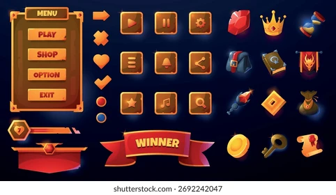
That is why PNG assets matter.
A transparent PNG acts like a cut-out prop on a stage. You can place it over dark backgrounds, layer it behind text, tilt it for motion, or repeat it to create rhythm. It saves time and keeps the composition clean.
This article explains how to build marketing graphics using gaming-inspired PNG elements such as cards, coins, chips, dice, and glowing effects. The focus stays on design method. The goal is not decoration for its own sake. The goal is to create clear, high-energy visuals that guide attention and support the message.
Choosing The Right PNG Elements For Gaming Visuals
The first step in gaming-style design is element selection.
Not every symbol works in every layout. Each PNG object should support the message.
Cards suggest strategy. Chips suggest stakes. Coins suggest reward. Dice suggest chance.
Choose elements that match the tone of the campaign.
Match The Symbol To The Message
If the banner promotes excitement, use motion symbols.
Coins flying outward. Dice mid-roll. Chips scattering.
If the message emphasizes strategy, choose controlled elements.
Stacked cards. Ordered chip piles. A single highlighted card.
This alignment keeps the visual clear.
Use Recognizable Gaming Motifs
Familiar icons reduce cognitive load.
People instantly understand cards, roulette wheels, and chips. The brain processes them quickly.
That is why many mobile promotions and download banners feature recognizable imagery connected to phrases like casino games download roulette. The icon reinforces the message. Users see the symbol and understand the theme before reading the text.
PNG assets make this easy.
Designers can place a roulette wheel behind a headline or layer chips around a call-to-action without worrying about background edges.
Avoid Visual Overload
Gaming graphics often fail because designers add too many objects.
A strong layout uses three to five elements.
Example structure:
- One hero object (roulette wheel or coin burst)
- One supporting element (chips or cards)
- One glow or light effect
Everything else becomes noise.
Clean structure makes the composition feel professional.
Building Motion With Static PNG Assets
PNG images do not move.
Good design makes them feel like they move.
Motion gives gaming graphics energy. It suggests action before animation even begins.
Tilt Objects To Suggest Direction
A straight object feels static.
Tilt a card slightly. Angle a stack of coins. Rotate a chip by a few degrees.
The eye follows the angle. It reads the object as part of a movement.
This technique works well with layered PNGs because transparent edges allow overlap without messy borders.
Use Depth Through Layering
Depth creates tension.
Place one PNG behind the text. Place another partially in front. Allow objects to overlap slightly.
This layering builds a scene.
For example:
- Background: subtle glow or gradient
- Middle layer: large roulette wheel or coin cluster
- Front layer: chips or cards crossing the headline edge
The result feels dimensional even on a flat screen.
Add Light And Contrast
Gaming graphics rely on contrast.
Bright coins against dark backgrounds. Neon highlights around edges. Shadows under objects.
PNG assets with transparent edges make this process simple.
You can place glow layers beneath them or add shadows without rebuilding the object.
Contrast guides attention.
Without it, the viewer’s eye wanders.
Structuring A Marketing Layout That Converts
A gaming-inspired graphic should do one job.
It should guide the viewer from attention to action.
Good structure makes that path obvious.
Step 1: Start With A Hero Element
Choose one object to dominate the frame.
This could be a glowing roulette wheel, a burst of coins, or a dramatic fan of cards.
The hero element grabs the eye first. It sets the tone.
Keep it large. Let it occupy real space.
Step 2: Frame The Message With Supporting PNGs
Supporting elements reinforce the theme.
A few scattered chips or dice near the edges can frame the headline without overpowering it.
Avoid symmetry that feels stiff. Slight imbalance feels natural.
Think of the layout as a table scene. The main object sits in the center. Other objects rest nearby.
Step 3: Anchor The Call To Action
Every marketing graphic needs a clear action.
Download. Play. Explore. Learn more.
Place the call-to-action in a stable area of the layout, usually near the bottom center or right side.
Surround it with subtle PNG accents such as coins or light bursts.
This visual framing draws the eye toward the button or text.
Strong structure ensures the viewer does not wander.
They see the image. They read the message. They understand the next step.
Polishing The Final Design
Balance Color And Contrast
Color drives emotion.
Gaming visuals often use deep blacks, bright golds, and neon accents. These colors create a high-energy mood. They also help PNG objects stand out.
Keep the palette tight. Two strong colors and one accent work best.
For example:
- Black background
- Gold coins and chips
- Red highlights for action points
This balance keeps the design bold without becoming chaotic.
Sharpen Focus With Negative Space
Empty space is not wasted space.
It allows the hero element to breathe. It keeps text readable. It prevents visual fatigue.
Designers often pack gaming graphics with objects. Resist that urge.
A few well-placed PNG elements feel stronger than a crowded composition.
Check Readability At Small Sizes
Marketing graphics appear in many formats.
Social media thumbnails. Mobile ads. App banners.
Zoom out and check the design at small scale. The headline should remain readable. The hero object should remain clear.
If elements blur together, simplify.
Clarity always wins.
Turning Simple PNG Assets Into Powerful Marketing Graphics
Gaming-inspired graphics work because they trigger quick recognition.
Cards suggest strategy. Coins suggest reward. Chips suggest stakes.
Transparent PNG assets make these visuals easy to build.
Designers can layer objects, create depth, and control contrast without complex editing.
The key is discipline.
Choose the right symbols. Limit the number of elements. Structure the layout so the eye moves naturally from image to message.
When done well, a simple set of PNG assets can create graphics that feel energetic, clear, and memorable.
Strong design does not rely on complexity.
It relies on smart placement, visual hierarchy, and purposeful motion.