Mobile UX has matured. The “make it pretty, add a hamburger menu” era is long gone. Users now judge apps like they judge airlines: it’s fine when everything works, and unforgettable when one tiny thing goes wrong. A checkout glitch, a confusing permission request, a button that’s just a bit too close to the screen edge. That’s all it takes.
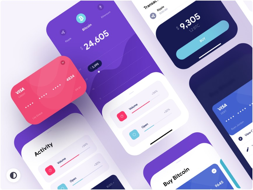
A quick reality check is visible here, where the flow has to stay fast, readable, and trustworthy under pressure. That’s the point: modern UX isn’t about vibes. It’s about reducing friction in places where people are impatient, distracted, or both.
Thumb-first layouts are winning
Designers have talked about “thumb zones” for years. Now it’s not a talk. It’s a constraint.
Bigger phones didn’t make people grow longer thumbs. So apps are drifting toward:
- primary actions lower on the screen
- bottom navigation that actually earns its space
- fewer top-right “critical” buttons (or at least duplicate actions lower down)
This is why a lot of interfaces feel like they’re sliding downward. It’s not laziness. It’s ergonomics.
Less UI, more clarity: the quiet comeback of restraint
There’s a visible move away from screens packed with badges, chips, floating buttons, tooltips, banners, and “one-time” offers that appear every time. Users are tired. Many apps are catching up.
The trend isn’t minimalism for aesthetics. It’s minimalism for comprehension. Clear hierarchy. One main message per screen. A calmer pace.
What’s interesting is that the best apps still sell. They still promote. They just do it without making the interface look like a supermarket aisle.
Motion gets smarter, not louder
Microinteractions aren’t new. What’s changing is the intent behind them.
The modern approach:
- use motion to explain what just happened, not to show off
- keep animations short enough to feel snappy
- respect “Reduce Motion” accessibility settings
Loading animations, subtle transitions, small haptic cues, a clean “saved” confirmation. These things don’t look dramatic in a case study. But they make the app feel reliable, and reliability is addictive.
Skeleton screens over spinners
A spinner says “wait.” A skeleton screen says “it’s coming, and it will look like this.” That difference is psychological, and mobile UX leans heavily on psychology.
Users forgive slow networks more than they used to, but only if the app is honest about what’s happening. Skeleton loading, progressive rendering, and smart placeholders reduce that anxious feeling of “did it freeze?”
Nobody wants suspense from a banking app. Or a food order. Or anything involving money, frankly.
Personalization shifts from “creepy” to controllable
Personalization used to mean “the app stalks everything and guesses.” Users pushed back. Regulations pushed back too. Now UX teams are learning a softer tactic: personalization with controls.
So instead of only algorithmic feeds, better apps offer:
- easy “not interested” actions
- preference tuning that takes seconds
- explanations like “recommended because you watched…”
The key trend is transparency. Users don’t mind smart suggestions. They mind feeling manipulated.
Trust UX is becoming a real discipline
A lot of mobile apps now handle sensitive stuff: payments, identity checks, location tracking, health data, real-money entertainment. That changes UX priorities.
Trust-driven UI shows up in small decisions:
- clear fee disclosure before the final step
- transaction timelines that match reality
- visible support access when something fails
- human language during verification, not robotic warnings
Even the tone matters. If an app sounds accusatory during KYC (“You have provided invalid documents”), it creates tension. If it sounds helpful (“This image is blurry, please retake in good light”), it reduces drop-offs. Same requirement, different result.
Biometrics and passkeys push logins toward “invisible”
Passwords aren’t dead, but they’re not the hero anymore. Mobile UX is leaning into face/fingerprint unlock, device-based authentication, and passkeys where ecosystems support them.
The trend here is reducing login friction without reducing security. Users love speed, but they hate feeling unsafe. A clean biometric prompt feels modern. A forced password reset loop feels like 2014.
Also: apps are getting better at handling the “edge cases” that used to break everything. New phone, lost SIM, changed email, locked device. Recovery flows are finally getting the UX attention they deserve.
Accessibility stops being a checkbox
Mobile accessibility is no longer just “increase font size.” It’s:
- color contrast that works outdoors, not just on a designer’s monitor
- tap targets that don’t require surgeon precision
- screen reader compatibility that isn’t half-broken
- captions and transcripts for media
- logical focus order and clear labels
And yes, accessibility is also good business. People share apps that feel easy. They abandon apps that feel like work.
Dark mode grows up
Dark mode used to be a trend. Now it’s expected. The shift is that apps are getting more thoughtful about it.
Bad dark mode is just inverted colors. Good dark mode considers:
- glare and eye strain
- hierarchy (not everything should be the same shade of charcoal)
- imagery and icons that still look clean
- readability at different brightness levels
Some apps even offer multiple dark themes: true black for OLED, softer dark for reading. Not necessary for everyone, but it signals care.
Forms and checkout flows are getting brutally optimized
A surprising amount of mobile UX is forms. Addresses, card details, OTPs, profile updates, complaint submissions. People hate forms. That’s why forms are a battleground.
Trends that keep showing up:
- fewer fields, smarter defaults
- inline validation that doesn’t shout
- autofill that actually works
- clear error states that explain the fix, not just the failure
The best mobile apps treat forms like a conversation. Short questions, clear answers, immediate feedback. The worst treat forms like paperwork.
Bottom sheets and modular screens keep taking over
Bottom sheets are everywhere because they’re practical. They reduce context switching. They keep users anchored. They’re also thumb-friendly.
The trend is toward modular UI patterns that let apps layer actions without dumping users into endless new pages. Search filters, settings, quick actions, previews, confirmations. All without losing the main thread.
That said, bottom sheets can get messy fast. Stacking sheets on sheets is the new “popup hell.” Good UX teams know when to stop.
“Offline-first” thinking returns
Not every user has perfect connectivity. Even in big cities, networks dip. Apps that acknowledge this feel smarter.
Offline-first UX can be as simple as:
- showing cached content instead of blank screens
- queueing actions and syncing later
- clear messaging when a feature needs connection
Users don’t demand miracles. They demand honesty and continuity.
The real meta-trend: UX is moving from decoration to operations
The hottest UX trend isn’t a color palette or a new animation curve. It’s operational UX. Designing for real conditions: lag, failed payments, refunds, moderation, safety, support, compliance, and human confusion.
Because that’s what mobile life looks like. People tap quickly. They multitask. They misread. They abandon. They come back. They forget passwords. They change phones. They get interrupted by calls. UX that doesn’t account for reality gets punished.
Mobile apps that win in 2026 aren’t necessarily the most original. They’re the most considerate. Clean flows, honest messaging, fast recovery from errors, and interfaces that feel like they’re on the user’s side. That’s the bar now.